

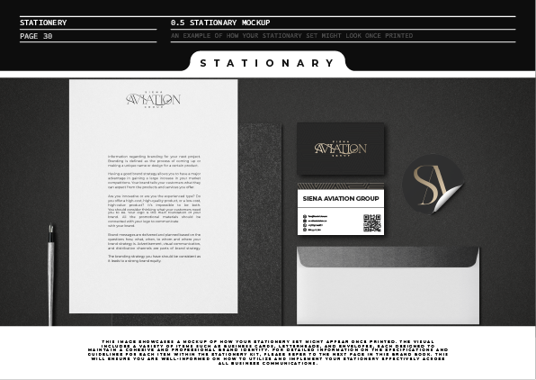
Siena Aviation Group is a high-end aviation brand offering private charter and corporate flight solutions across international destinations. The project was focused on building a refined and intelligent identity that would capture the precision, sophistication, and authority of a premium aviation group. From the earliest sketches to final deployment, every step of the creative journey was built around exclusivity and performance — two pillars at the heart of the Siena brand.
The client requested a logo that:
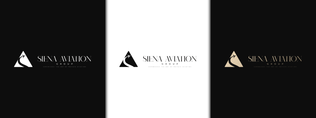
Initial Exploration & Drafts
To align with Siena Aviation’s detailed creative brief, I developed a range of initial design concepts that merged flight-inspired symbolism with refined simplicity. Each direction aimed to visualize motion, altitude, and the timeless beauty of air travel.
These explorations captured Siena’s personality — where high design meets precision engineering — expressing elevated luxury through simplicity and structure.
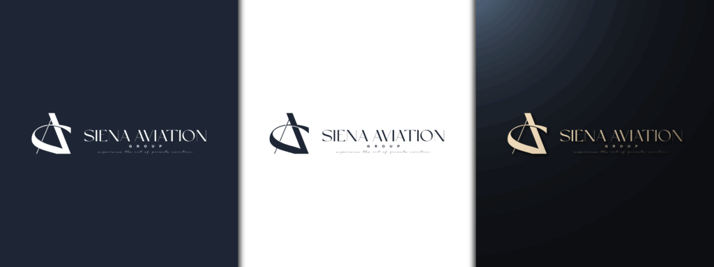
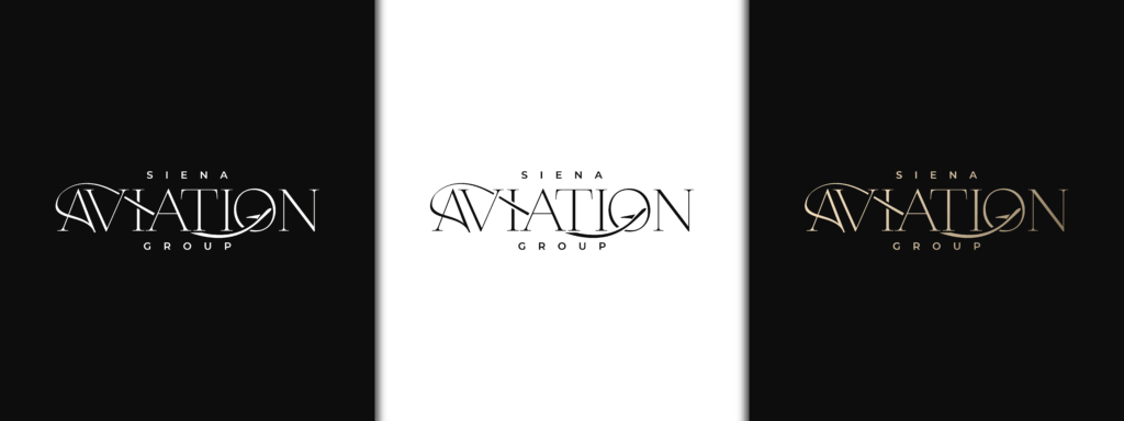
Initial Concepts Preview
Through tonal variations in typography, spacing, and form, we sought to express Siena’s understated confidence.
Every design was prepared in both dark and light variations, allowing flexibility across print, web, and aircraft-livery applications.


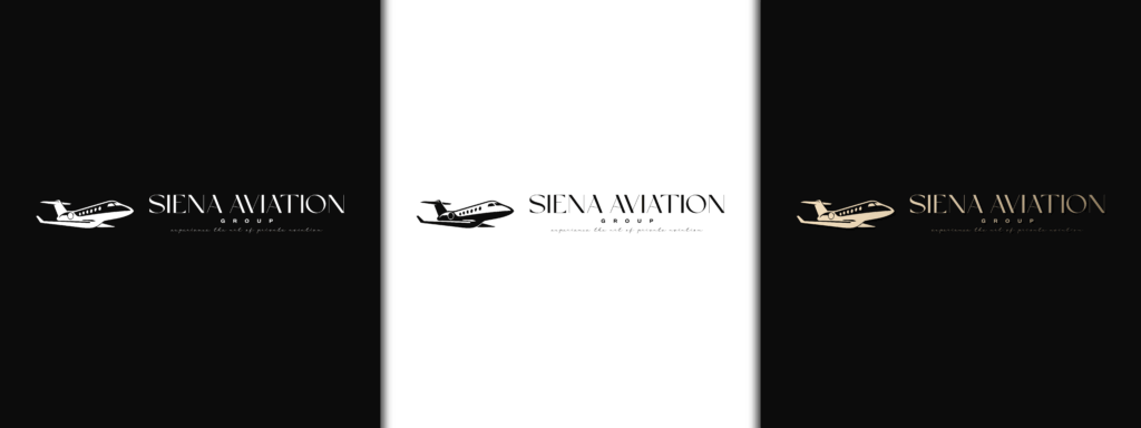
Revision Stage
Refining the Vision — Transforming Feedback Into Focused Design
During the revision phase, we collaborated closely with the Siena team to refine the chosen direction — maintaining the original sophistication while enhancing its clarity and legibility across scales.
We explored micro-adjustments in the icon proportions and refined the wordmark spacing to achieve a timeless finish that would stand alongside global aviation leaders.
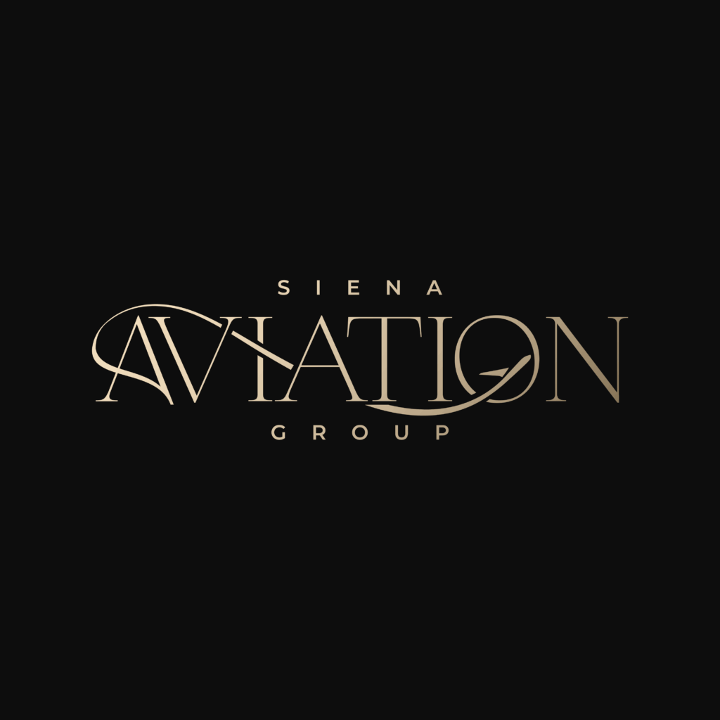
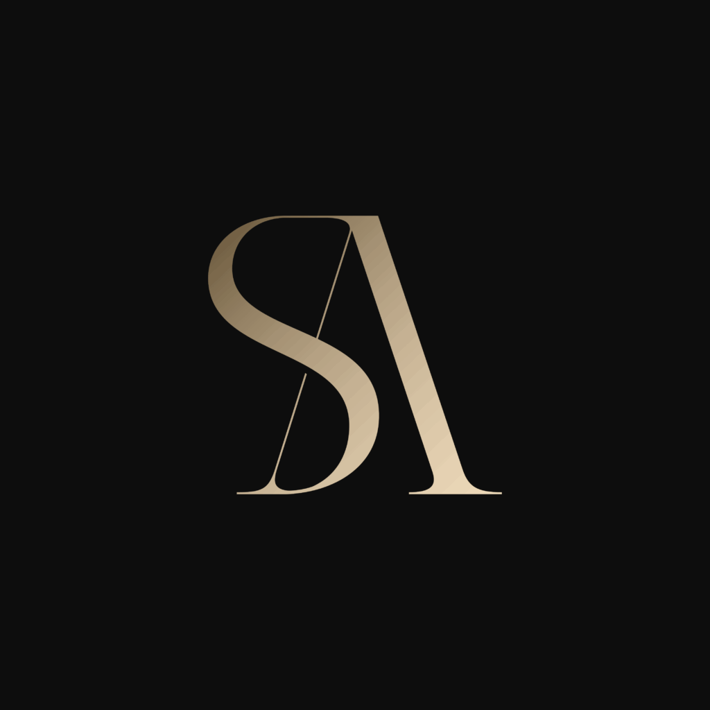
The updates also extended to the supporting palette, shifting toward charcoal black, champagne gold, and clean white, ensuring a modern, corporate appeal with luxury undertones.
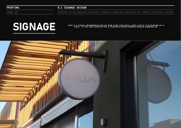
This stage was all about precision, testing the logo system across mockups and backgrounds to guarantee visual integrity in every format — from cockpit decals to corporate brochures.

Finalization Stage
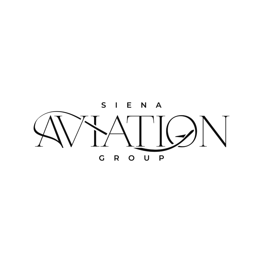
Logo Lock-In — Approving the Mark that Anchors the Brand
The final mark embodies everything Siena Aviation represents — luxury, professionalism, and a seamless flight experience.
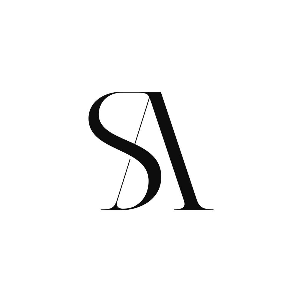
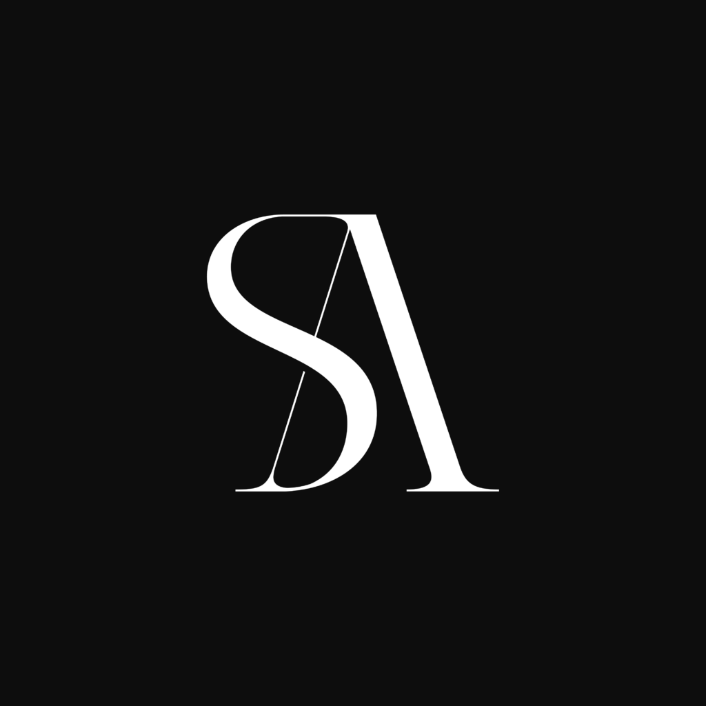
A distinctive monogram “SA” was developed as a visual signature, optimized for both horizontal and stacked layouts.
We produced multiple brand assets including alternate color systems, logo lockups, and scalable icon sets.
Each variation was fine-tuned to work across physical and digital applications, from stationery and uniforms to mobile and flight interface screens.
This final step confirmed Siena’s brand readiness for implementation across its new identity ecosystem.

Brand Identity
The comprehensive brand identity system built for Siena Aviation ensures every piece of communication — from printed brochures to digital campaigns — maintains the same visual language and emotional depth.
Once the logo was finalized, we transitioned into the Brand Identity Phase — transforming a single mark into a comprehensive, functional, and beautiful visual system.
This stage was dedicated to building a cohesive brand experience that would empower the Oshens team to maintain consistency across every platform and customer touchpoint. From elegant packaging to professional stationery and digital assets, every element was crafted to echo the salon’s philosophy: “Look Amazing. Feel Unstoppable.”


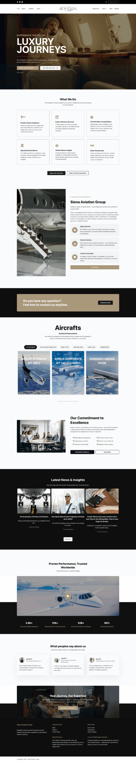
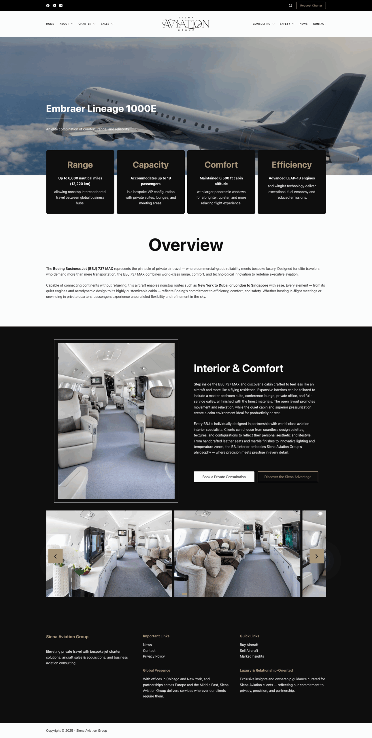
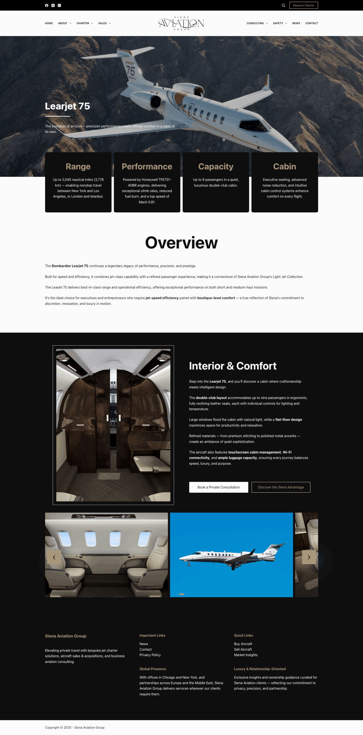
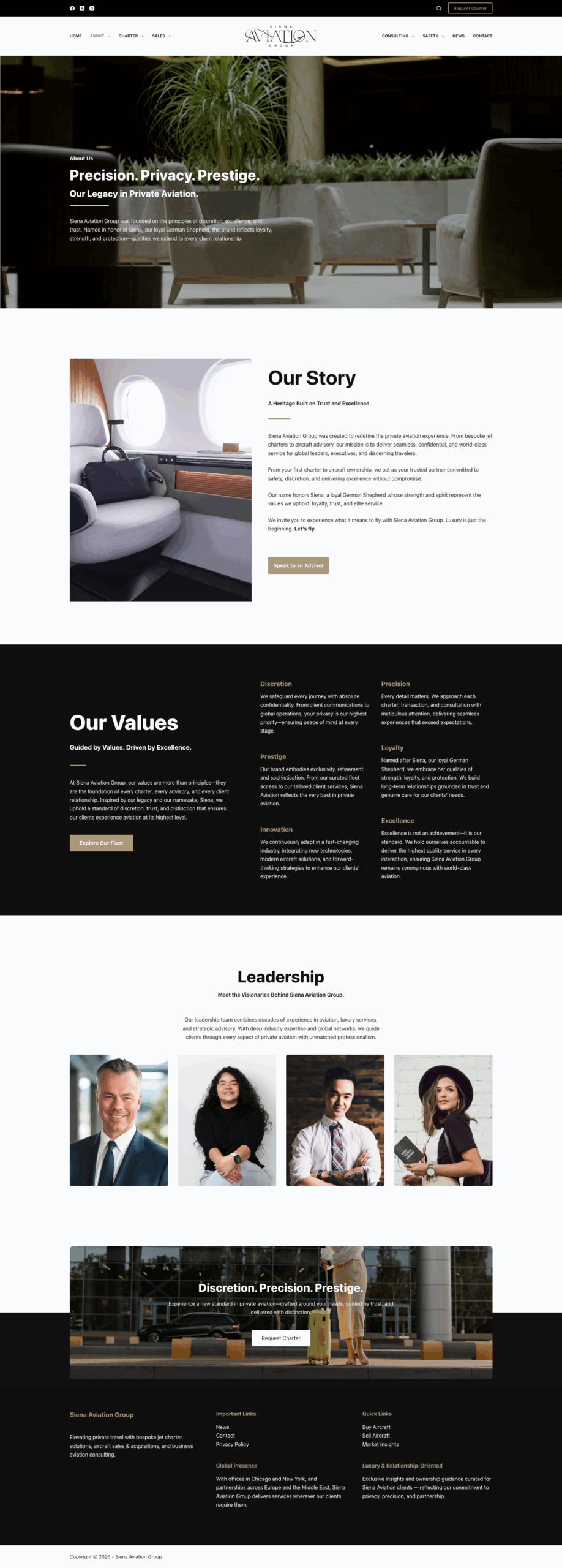
Website Design & Development
Bringing the Brand to Life Online
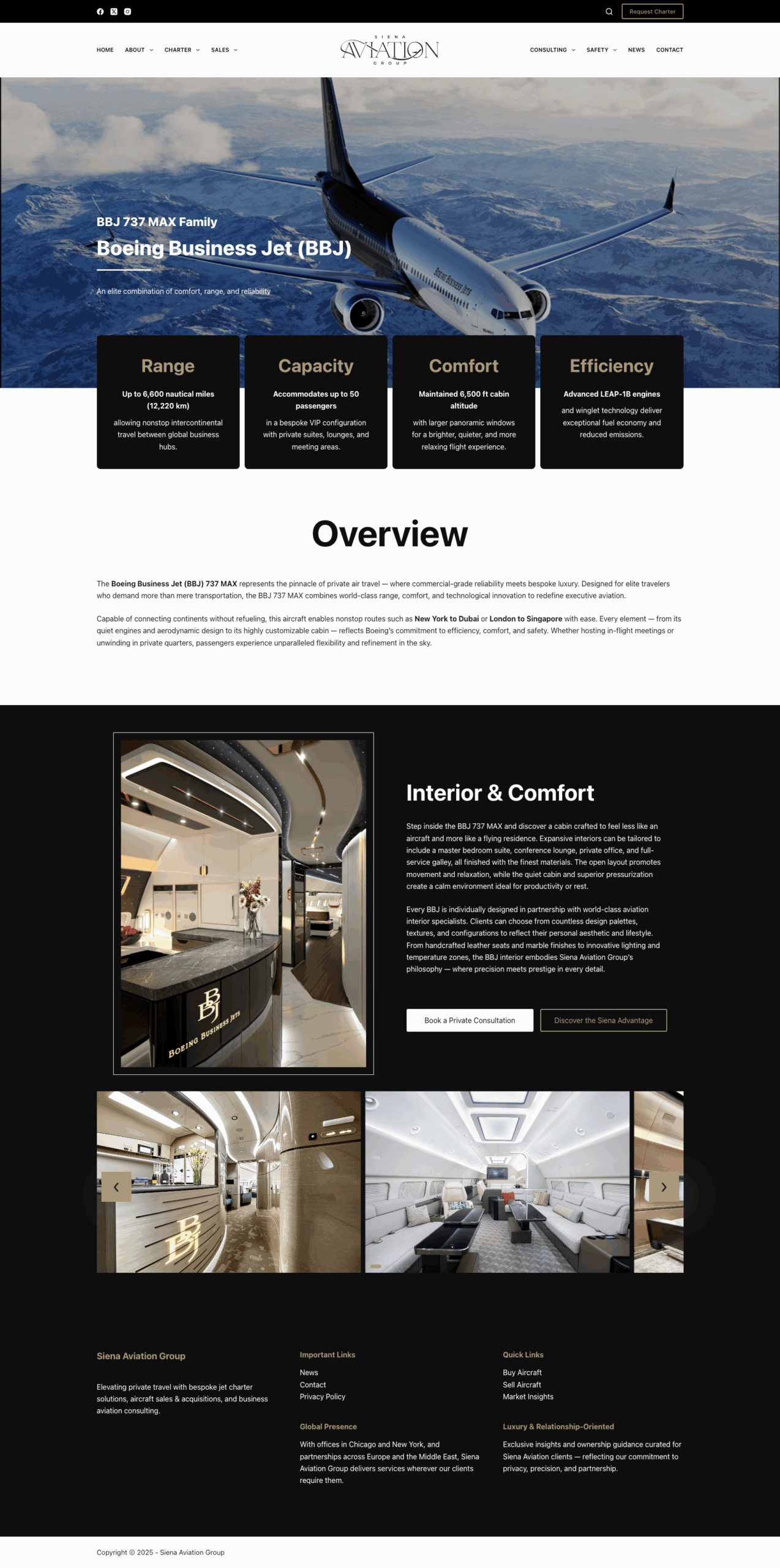
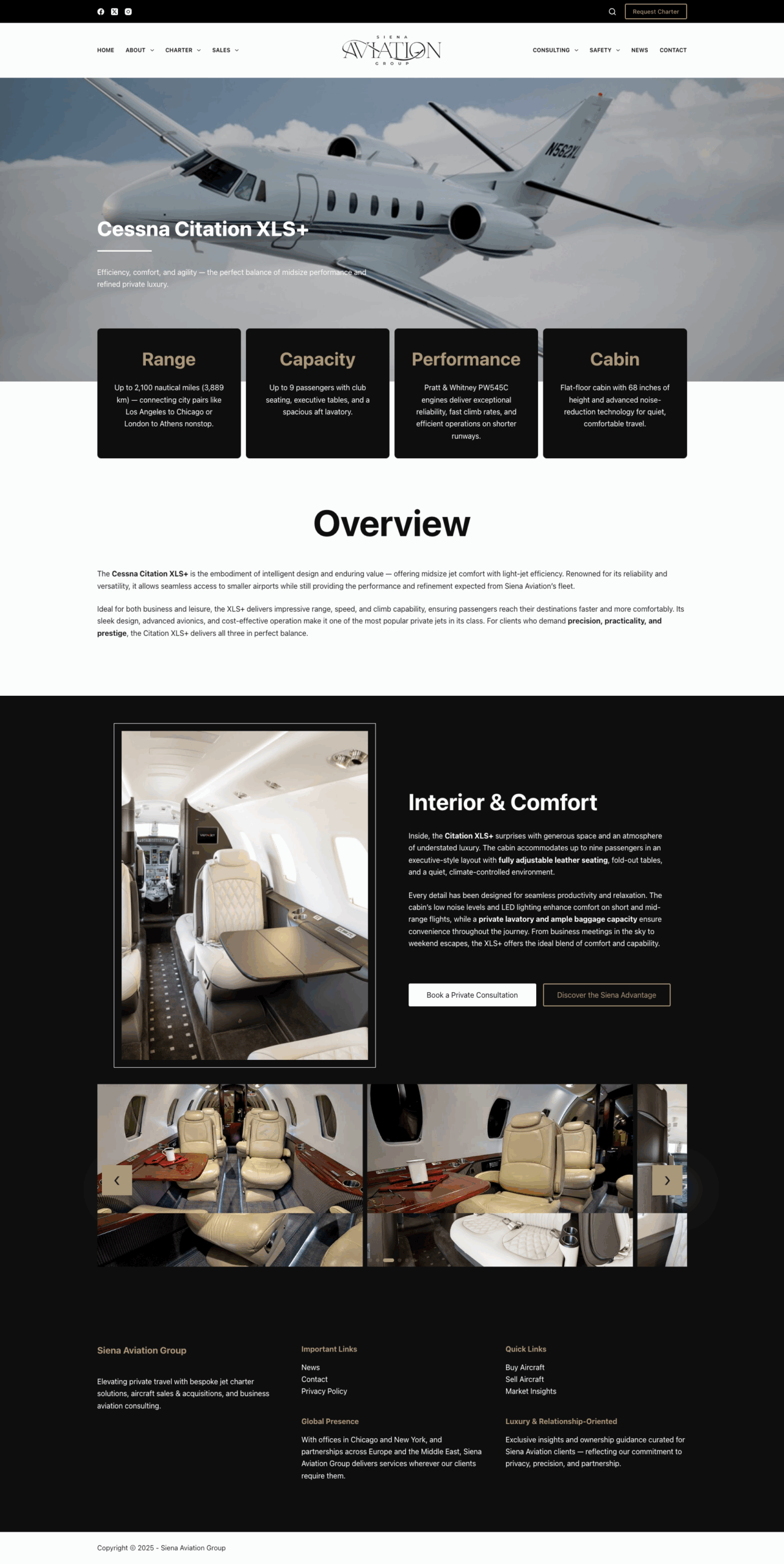
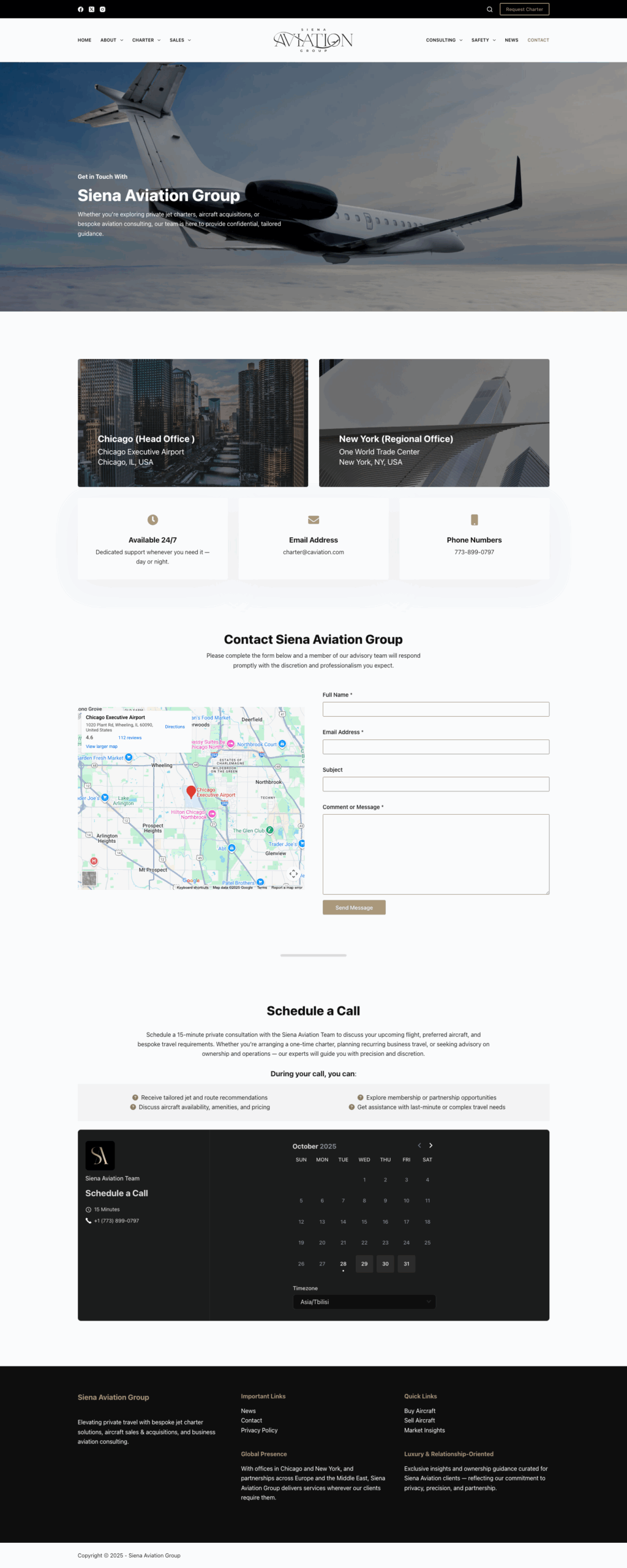
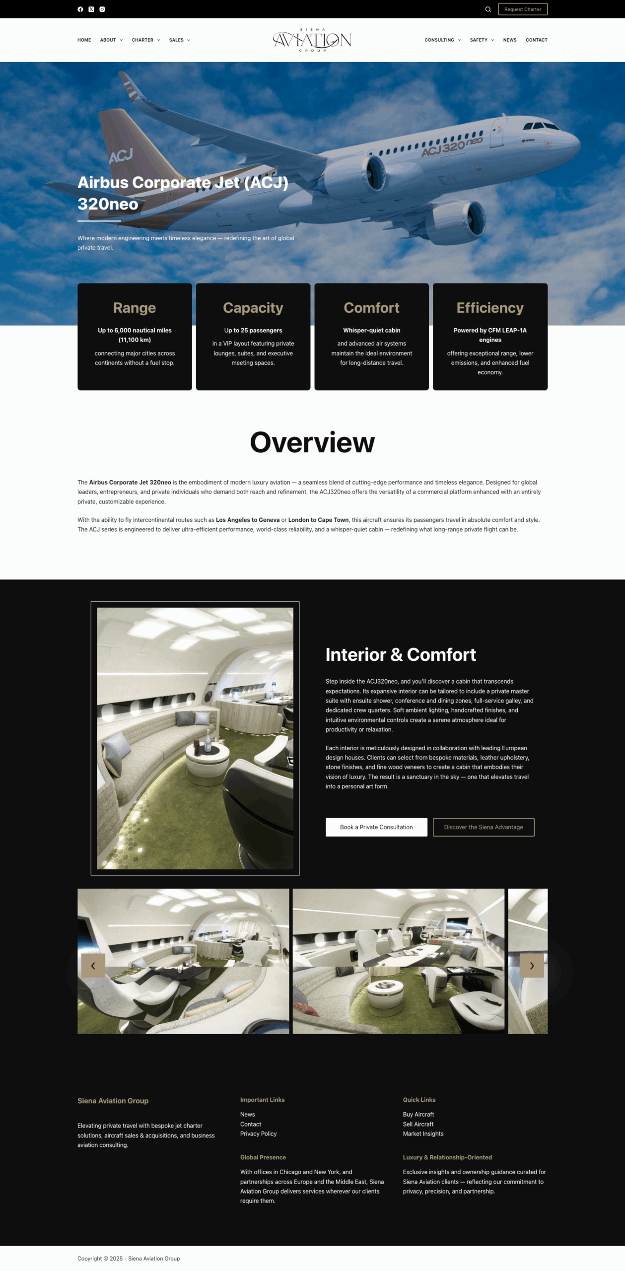
Siena Aviation’s digital platform was designed to translate its new visual language into an elegant and immersive online experience.
The website emphasizes ease of navigation, professional tone, and immersive imagery that reflects the exclusivity of private aviation.
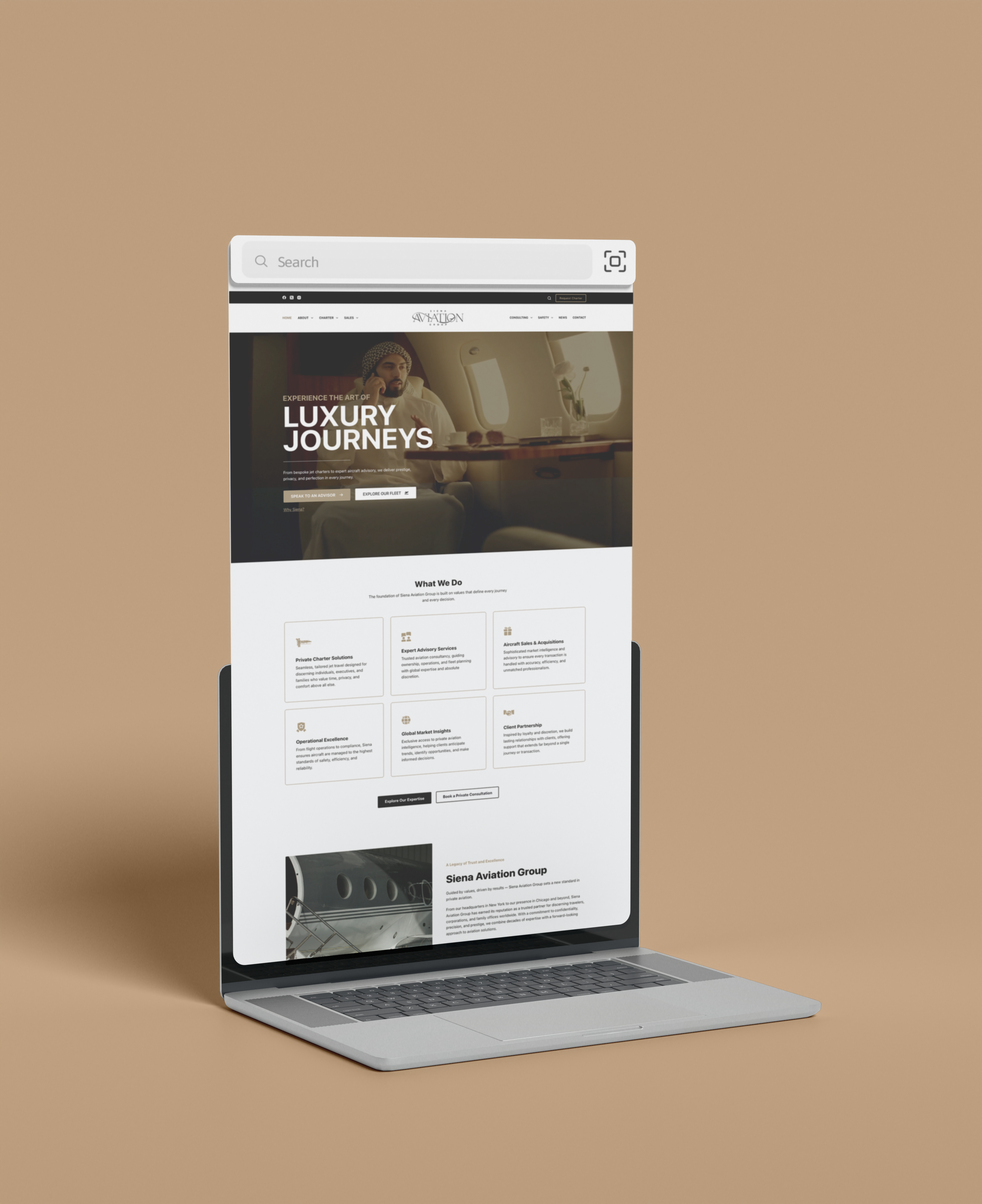
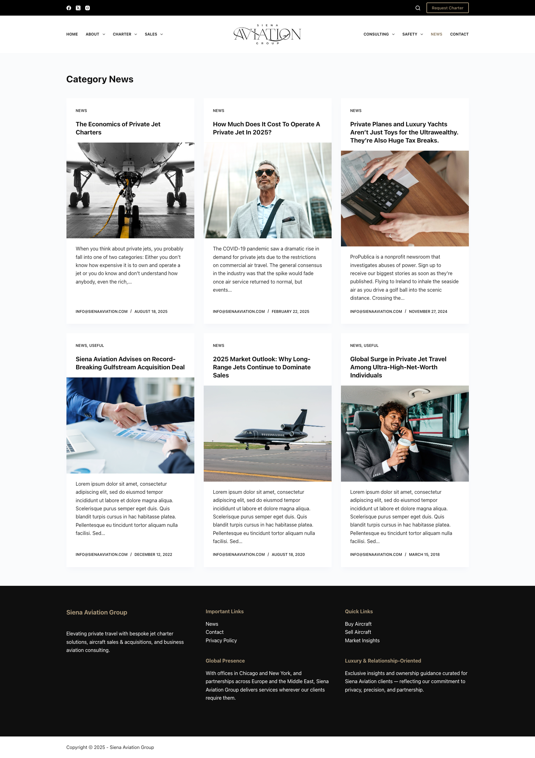
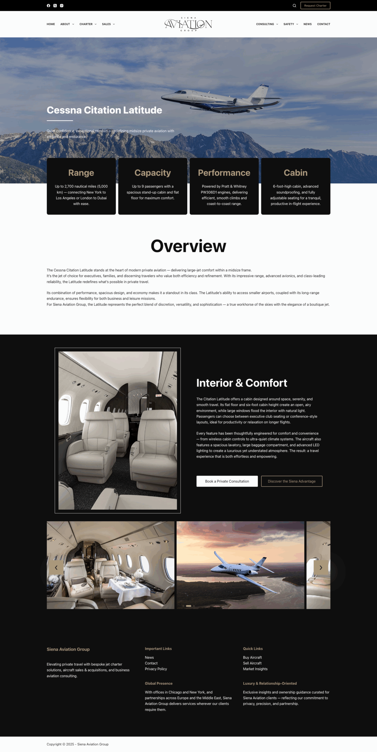
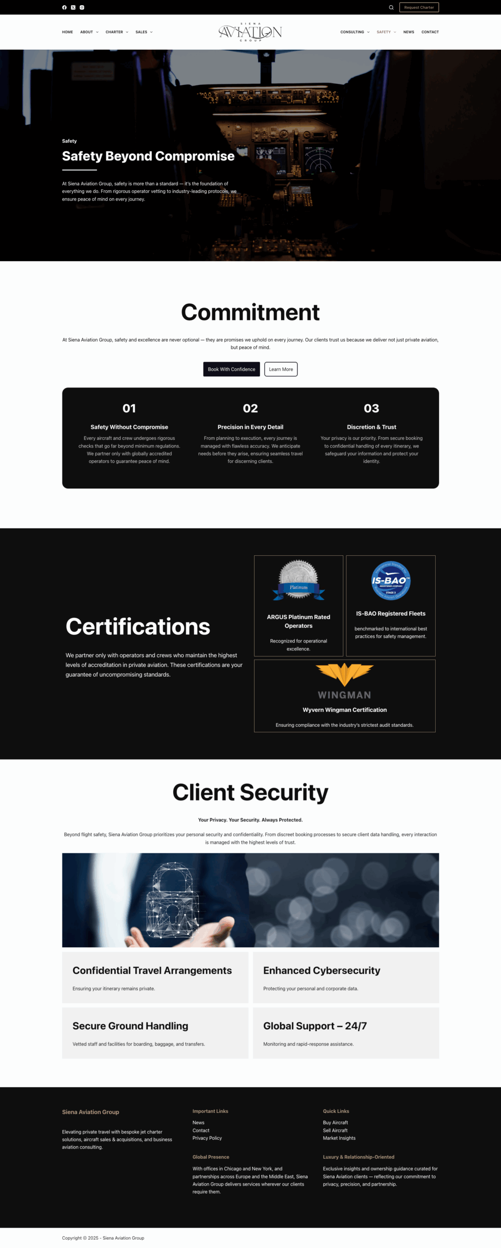
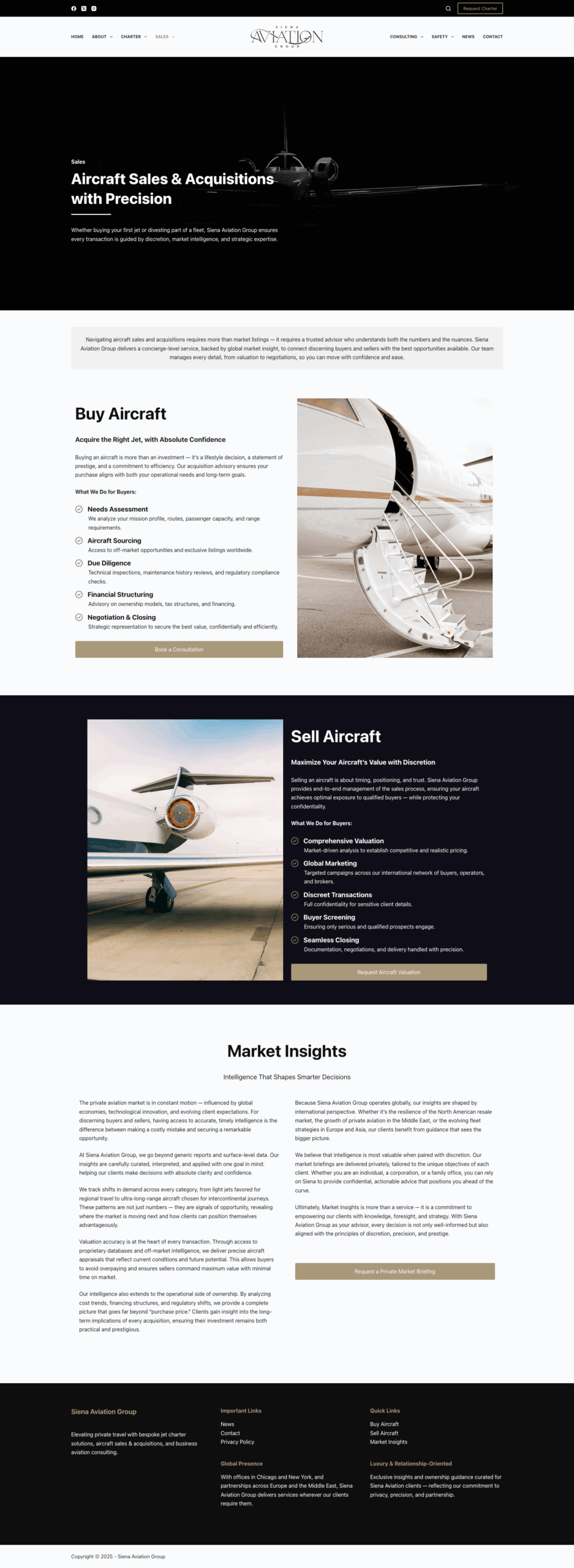
Home Page
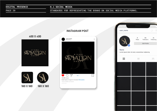
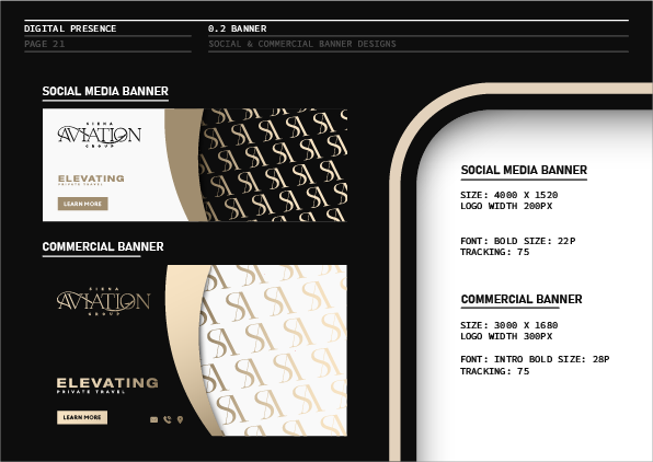
Social Media Templates