
Audimodal Design is a premier acoustic and architectural design studio based in New York City, specializing in recording studios, performance spaces, and media environments. With decades of experience and a portfolio that includes work for global artists and producers, the firm’s mission is to merge technical precision with creative design.
The goal of this collaboration was to craft a brand and digital identity that captured Audimodal’s sophistication, sound expertise, and architectural artistry — a visual and verbal language that communicates harmony, innovation, and mastery in sound design.
The client requested a logo that:
Initial Exploration & Drafts
To align with the client’s vision and extensive industry portfolio, I conducted in-depth research into their featured clients, studio projects, and architectural details. This informed a series of initial directions that explored:
These early studies aimed to create a visual harmony between sound and structure, reflecting Audimodal’s philosophy: “Harmony in Design, Precision in Sound.”
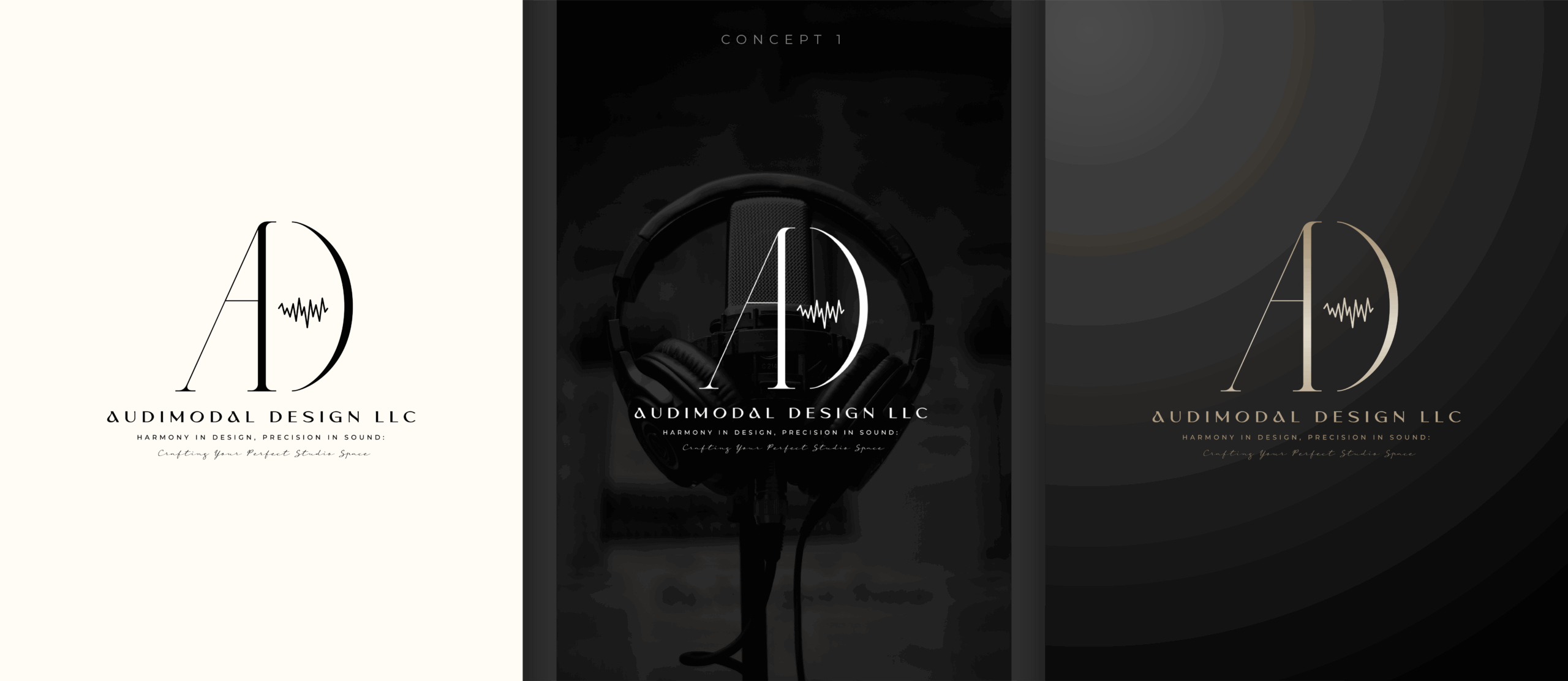
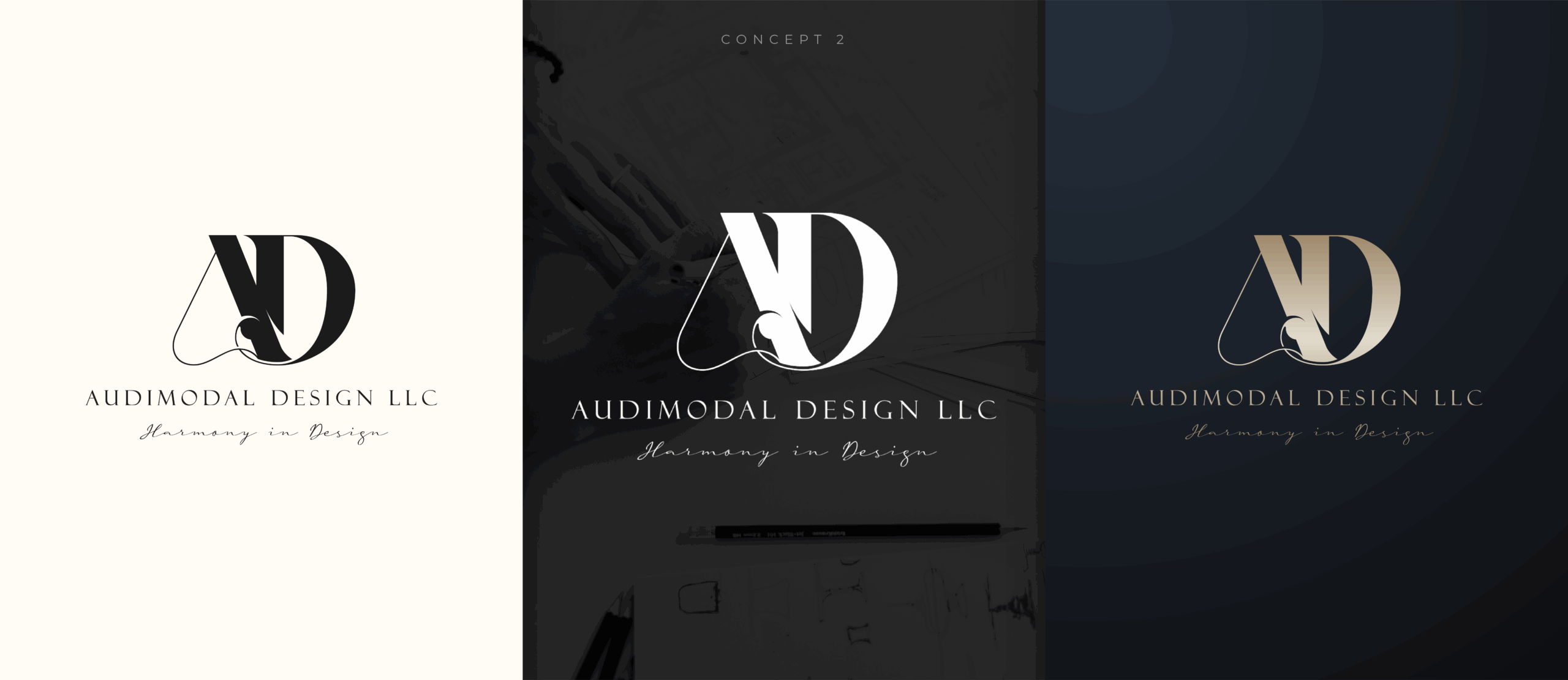
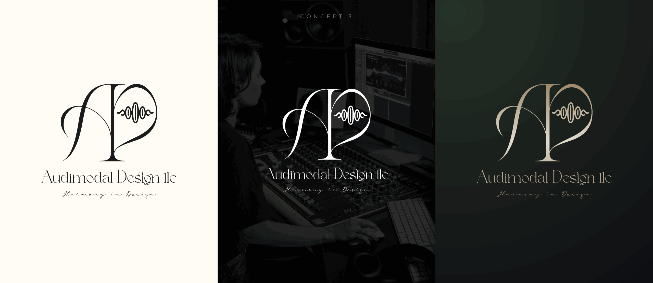
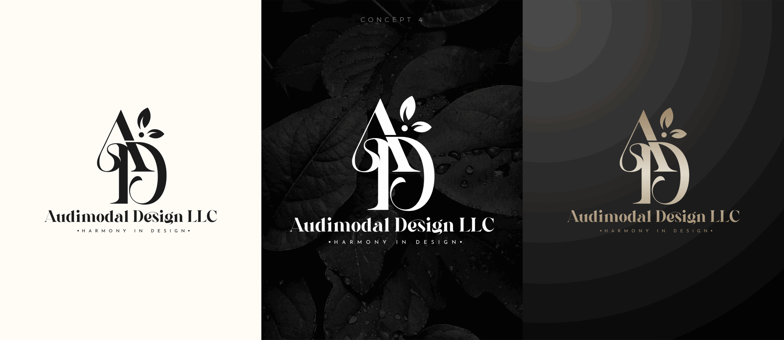
Initial Concepts Preview
To visually express the fusion of architecture, acoustics, and artistry, I explored a range of monogram-driven concepts emphasizing symmetry, balance, and motion. Each direction focused on creating a timeless mark that could scale effortlessly from digital interfaces to physical studio signage.
Concept Overview:
- Concept #1–2: Geometric “AD” monograms with subtle wave patterns and grid-based alignment
- Concept #3–4: Minimal marks inspired by technical drafting and blueprint forms
- Concept #5–6: Circular insignias symbolizing unity, resonance, and continuity in sound
- Concept #7–8: Refined metallic treatments exploring depth, contrast, and light reflection
These initial explorations established a strong design foundation, connecting the brand’s architectural precision with the warmth and creativity of professional audio craftsmanship.
Revision Stage
Refining the Vision — Aligning Sound, Structure & Identity
After presenting the initial logo explorations, we transitioned into the revision stage, a collaborative process that brought the brand’s visual and conceptual direction into focus.
Audimodal Design had a clear identity rooted in architectural precision and sonic harmony — a balance of art and engineering. Our goal during this phase was to refine that essence into a logo system that conveyed trust, sophistication, and innovation, while remaining timeless across applications such as architectural drawings, studio signage, and digital platforms.
Finalization Stage
Logo Lock-In — Approving the Mark that Embodies Sound & Structure
With the design direction refined and client feedback aligned, we entered the Finalization Stage — the moment when Audimodal Design’s new brand identity reached its definitive form.
The finalized logo became more than a visual mark; it evolved into a symbol of precision, craftsmanship, and creative harmony. Designed to represent the intersection of sound engineering and architectural artistry, the mark communicates balance — technical yet elegant, bold yet timeless.
This phase ensured that every design detail, from proportions to color refinement, anchored the brand’s future growth across all physical and digital touchpoints.
Brand Identity
Logo Lock-In — Approving the Mark that Embodies Sound & Structure
Once the logo was finalized, we transitioned into the Brand Identity Phase — transforming a single mark into a comprehensive, functional, and beautiful visual system.With the design direction refined and client feedback aligned, we entered the Finalization Stage — the moment when Audimodal Design’s new brand identity reached its definitive form.
The finalized logo became more than a visual mark; it evolved into a symbol of precision, craftsmanship, and creative harmony. Designed to represent the intersection of sound engineering and architectural artistry, the mark communicates balance — technical yet elegant, bold yet timeless.
This phase ensured that every design detail, from proportions to color refinement, anchored the brand’s future growth across all physical and digital touchpoints.


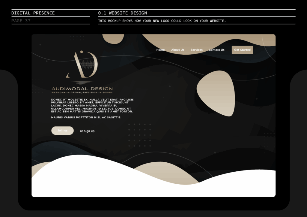


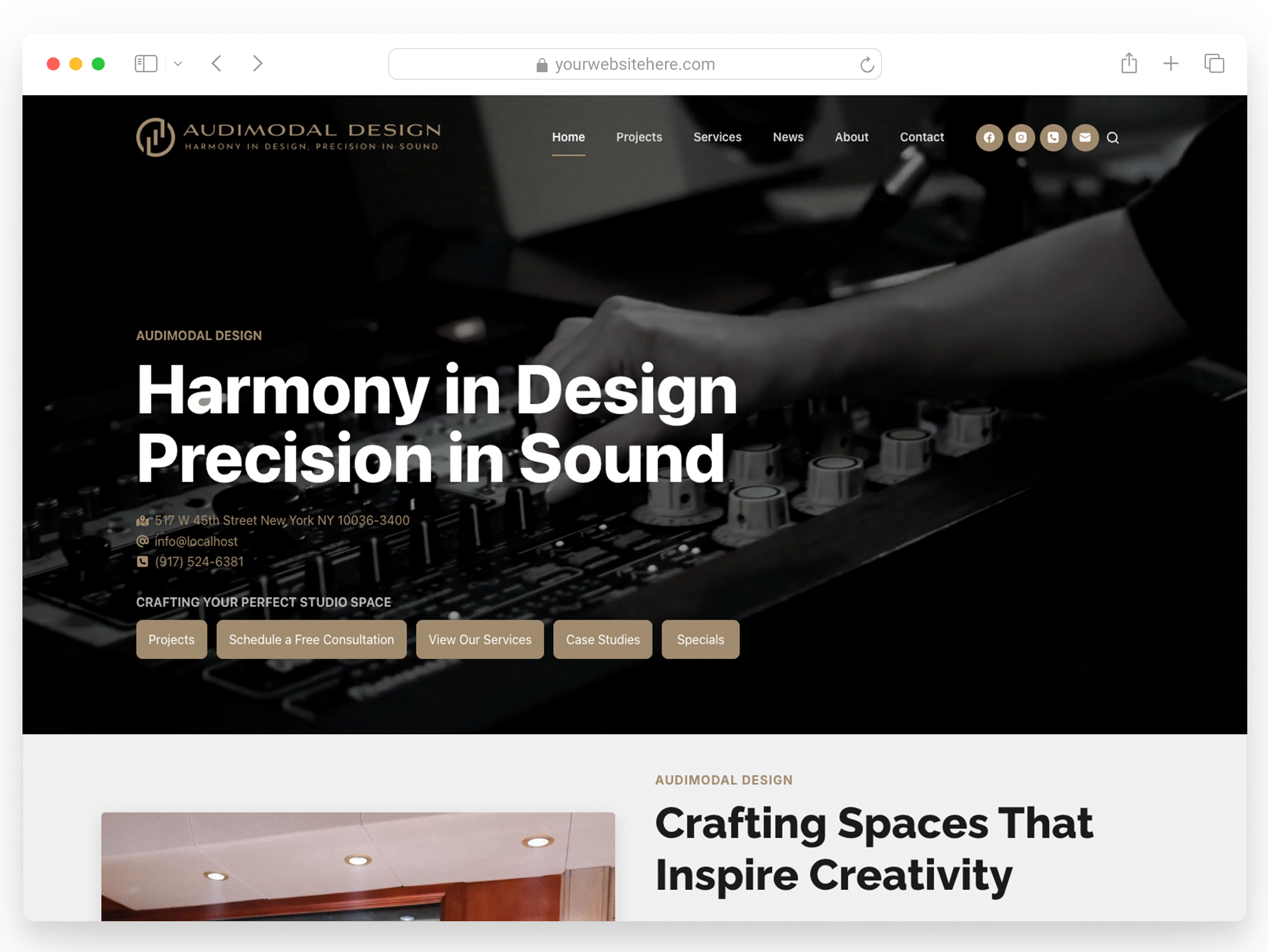
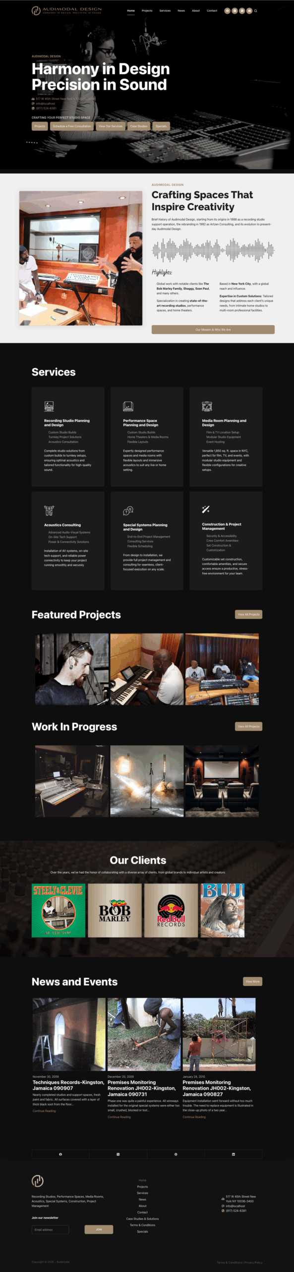
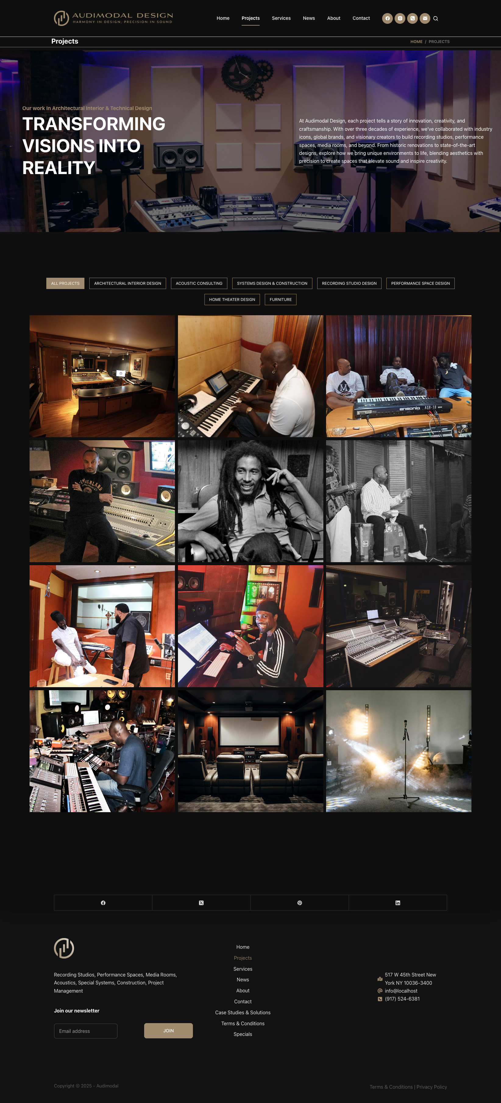
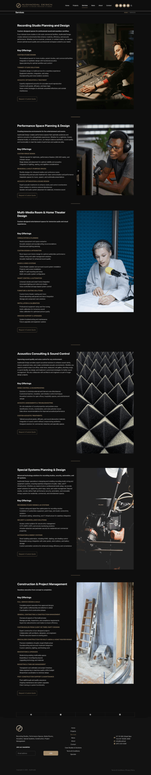
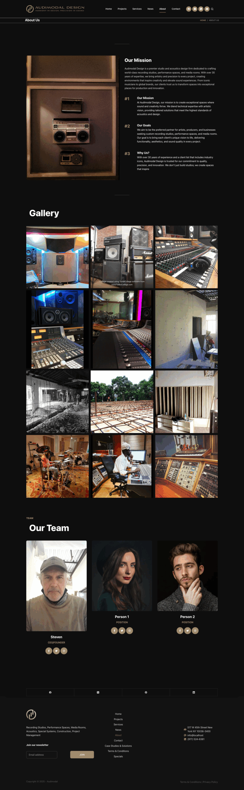
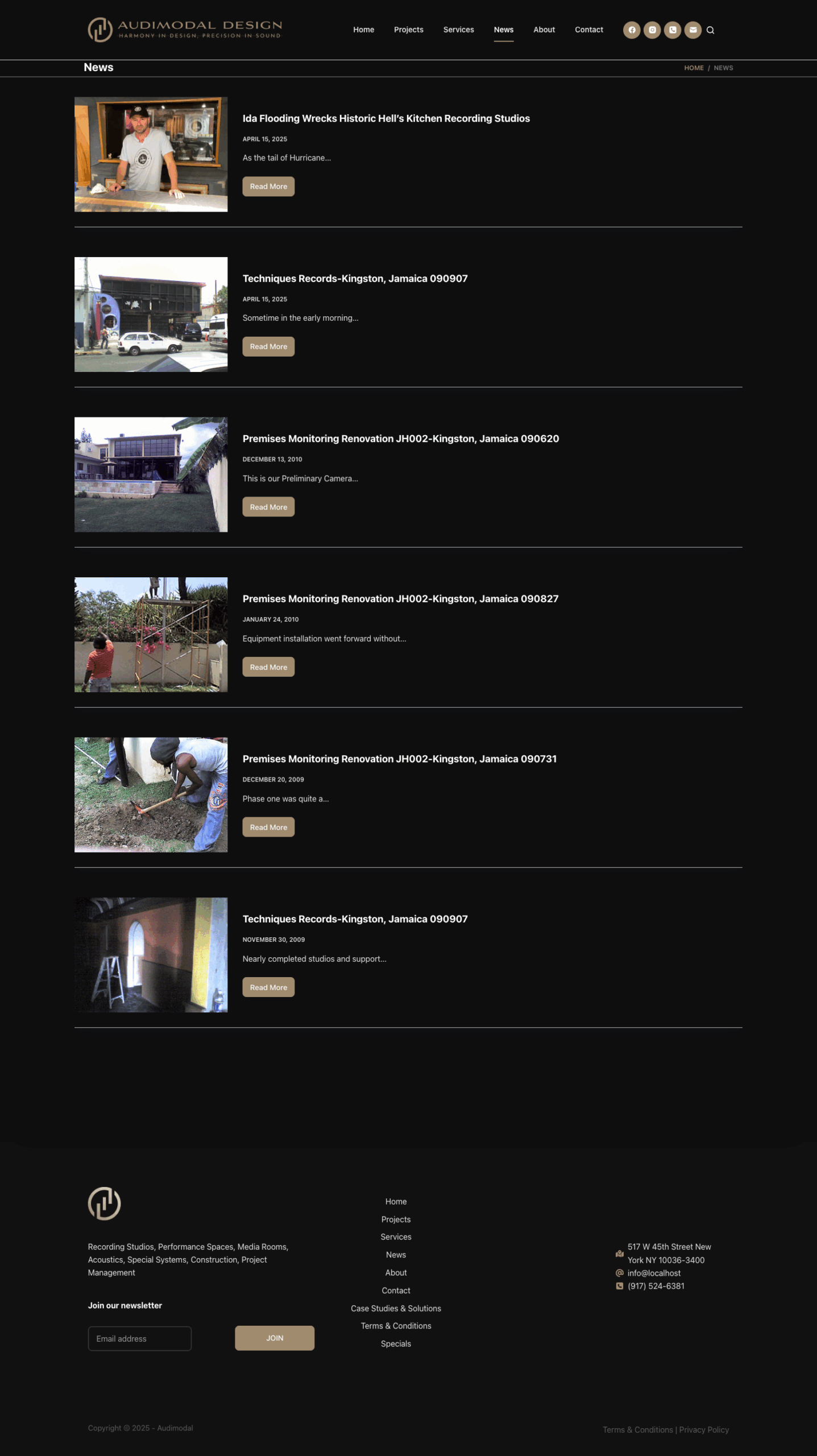
Website Design & Development
Bringing the Brand to Life Online
Following the brand identity phase, we designed and developed a website that brings Audimodal Design’s philosophy — “Harmony in Design, Precision in Sound” — to life. The site mirrors the brand’s sophistication, technical mastery, and dedication to crafting immersive acoustic spaces.
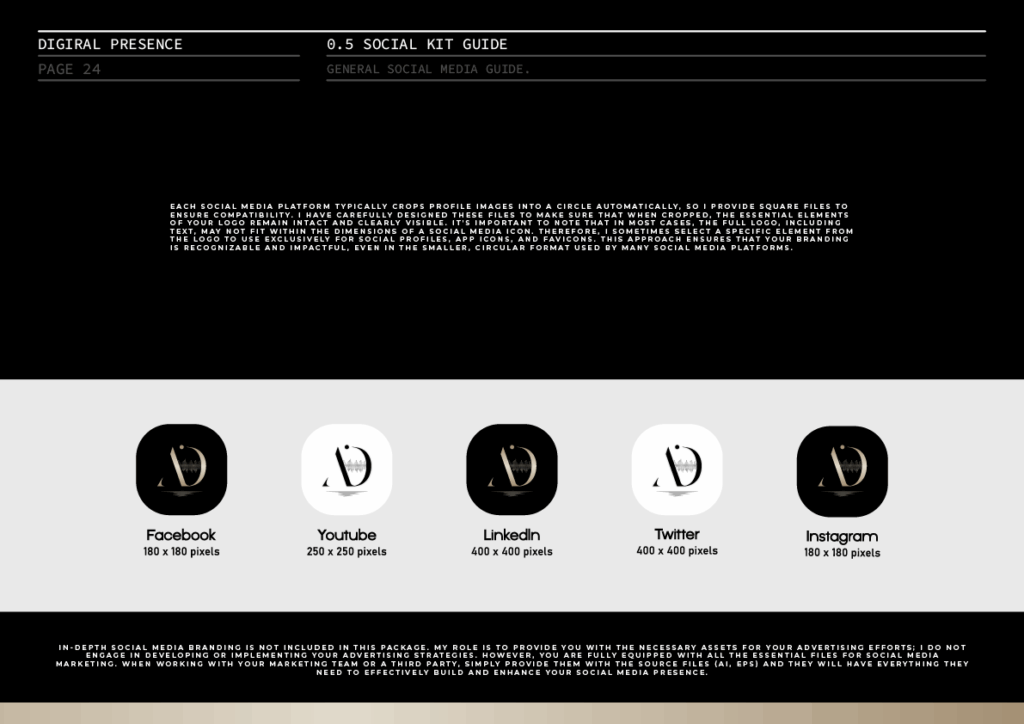
Social Media Templates